A modern face for the new generation
The challenge
Elektro Napral is a medium-sized company in its third generation. Modernity and efficiency should now move into tradition. The desire was to stand out clearly from the competition and to show a kind of signal effect on the road.
Elektro Napral is a medium-sized company in its third generation. Modernity and efficiency should now move into tradition. The desire was to stand out clearly from the competition and to show a kind of signal effect on the road.
The solution
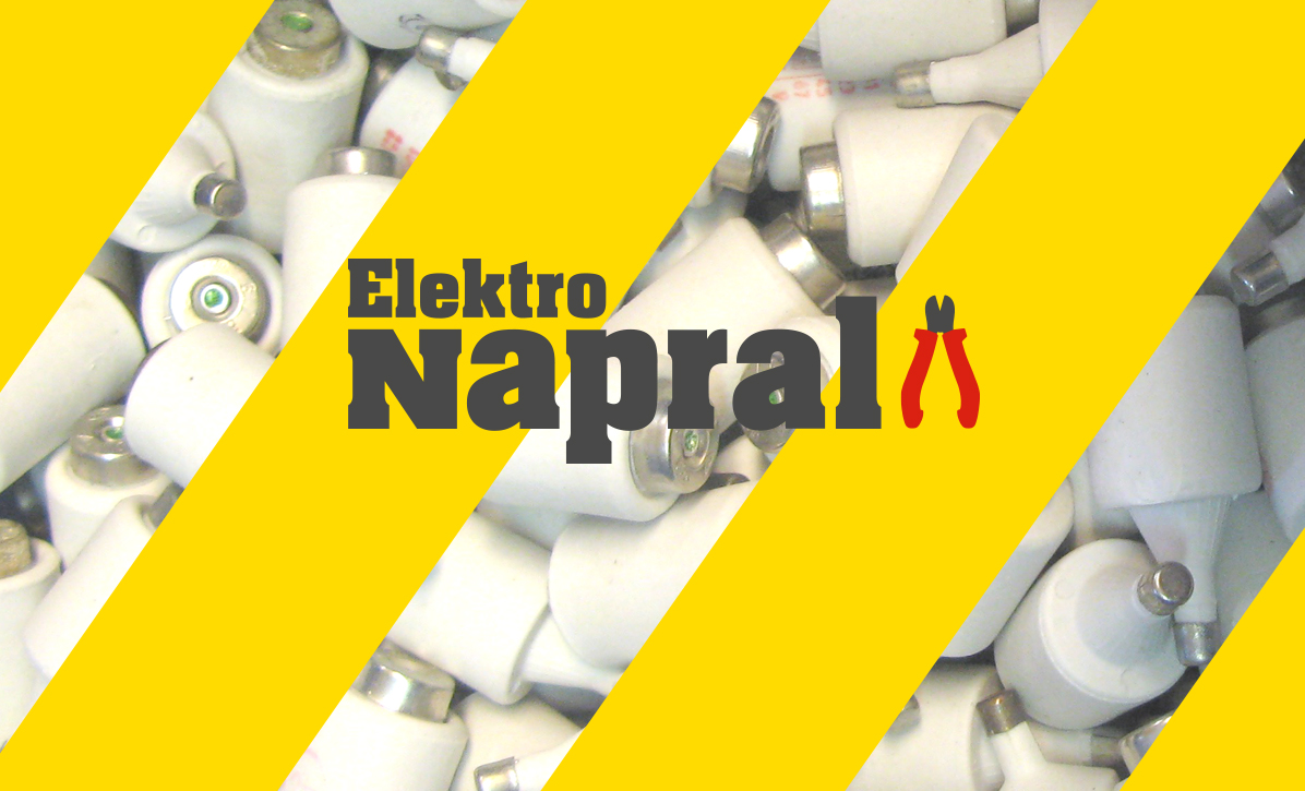
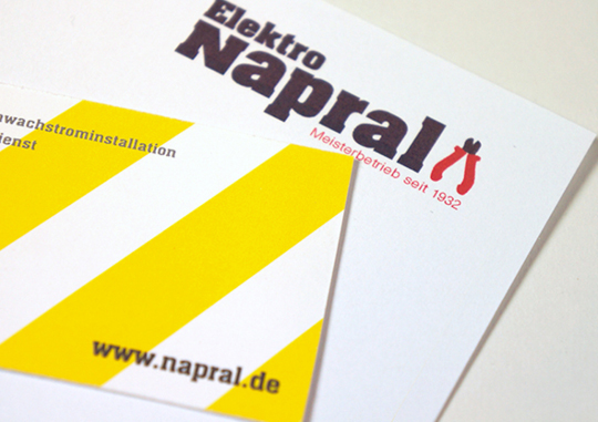
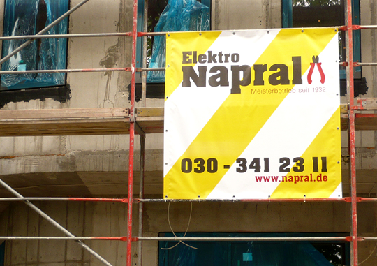
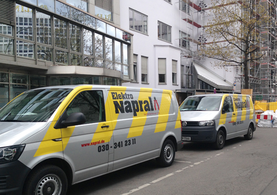
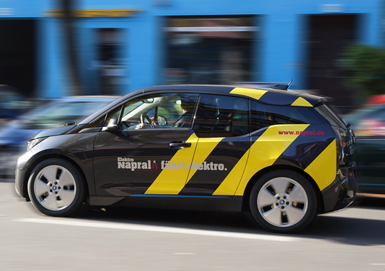
The new appearance is unmistakable due to its distinctive colour climate. The bold, bright yellow stripes are reminiscent of electric beams as well as the typical barrier tapes on building sites. The side cutter represents the role of the craftsman, especially that of the electrician. The typography is bold and serif. It emphasises the down-to-earth nature and tradition of the company. The unusual style of writing makes a reference to modernity.
The new appearance is unmistakable due to its distinctive colour climate. The bold, bright yellow stripes are reminiscent of electric beams as well as the typical barrier tapes on building sites. The side cutter represents the role of the craftsman, especially that of the electrician. The typography is bold and serif. It emphasises the down-to-earth nature and tradition of the company. The unusual style of writing makes a reference to modernity.
Corporate Design
Logo, Stationary, Vehicle Fleet, Banner, Website


You must be logged in to post a comment.