The new CD of the German Archeological Institute
The German Archaeological Institute is a federal institution in the department of the Federal Foreign Office. Since its foundation in Rome in 1829, the DAI has developed into one of the largest research institutions in the field of archaeology and ancient studies worldwide. Today, the Institute is present in Germany and abroad with its headquarters in Berlin, three commissions, seven departments and four field offices as well as numerous research centres. With its partners, the DAI explores fundamental questions of human history and ancient cultures in its numerous projects in order to understand our civilisations today and to help preserve them and make them recognisable as part of cultural identity.
The challenge for the development of the new corporate design was to make the tradition-rich institute with its lively and modern science more visible. Important for the new concept was the integration of the 11 DAI branches worldwide. The aim was to develop a modern presence that inspires and motivates both internally and externally.
Develop identity with strategy
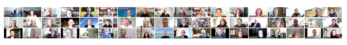
Together in workshops and webinars, we initiated the development process with different DAI teams in 2020. The values and goals were reflected and discussed. In the process, a principle was sharpened according to which the DAI has been operating since its foundation:
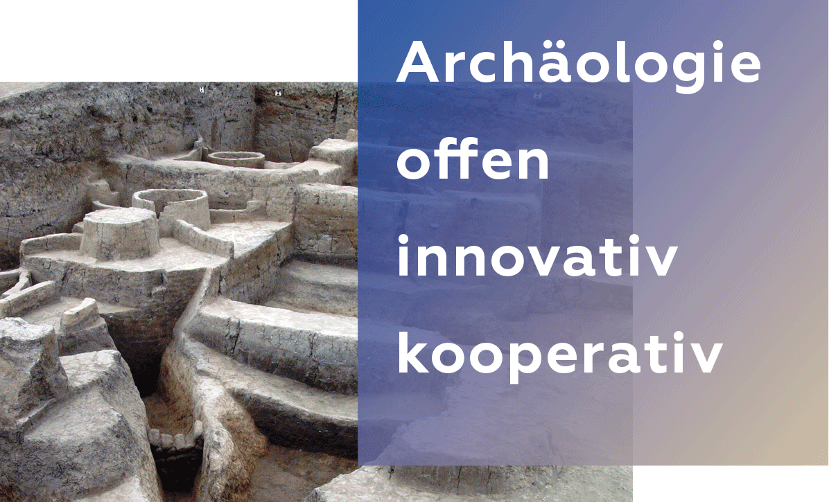
Das DAI verbindet
Antiquity & Present / Different Tribes & Cultures /
Scientists & Institutions Worldwide
We have translated this principle into a modern appearance, with the different design elements such as logo & colors, typography, images, labeling element and their interaction. The underlying visual character values are defined as: open & transparent scientific & innovative human & cooperative
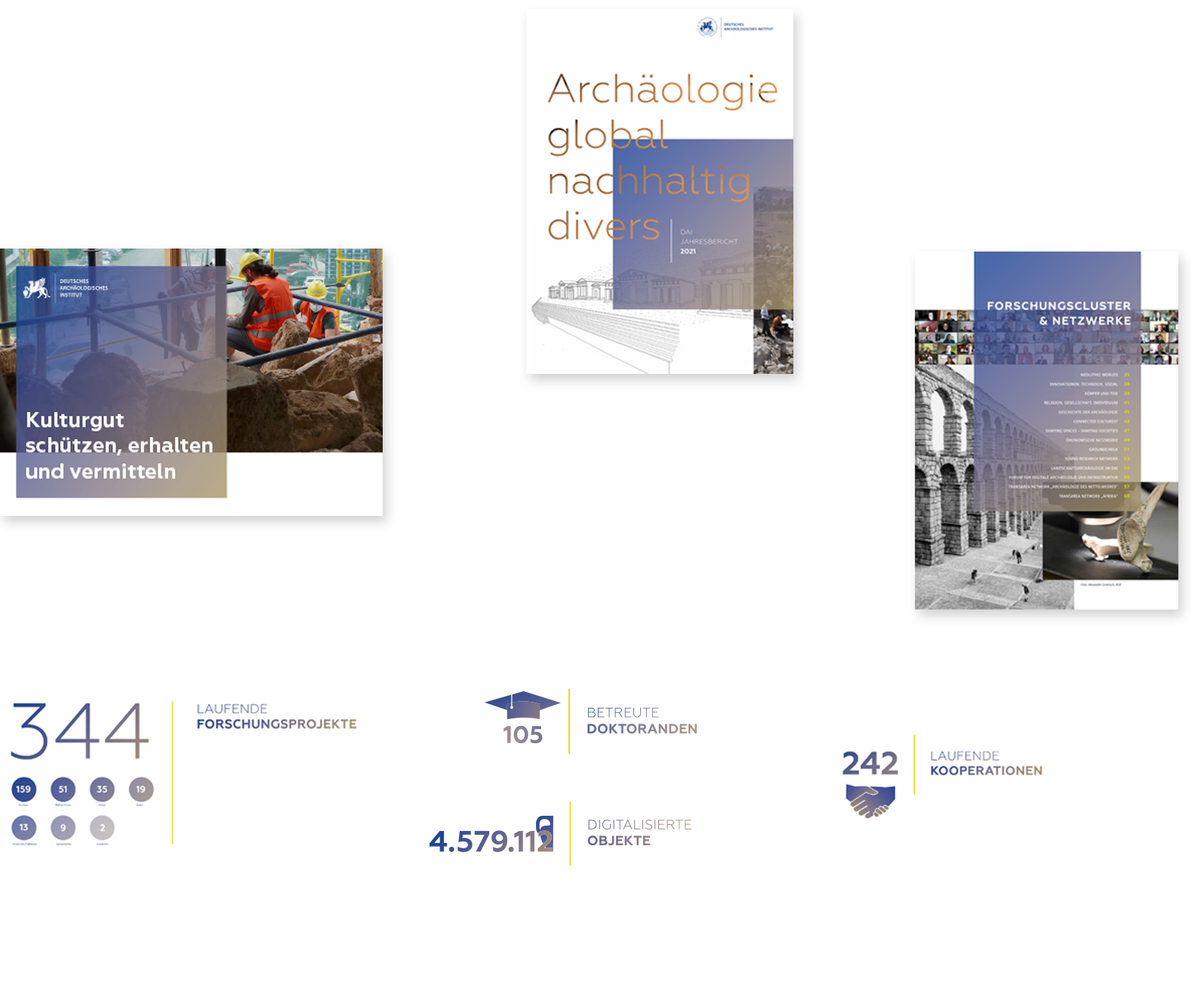
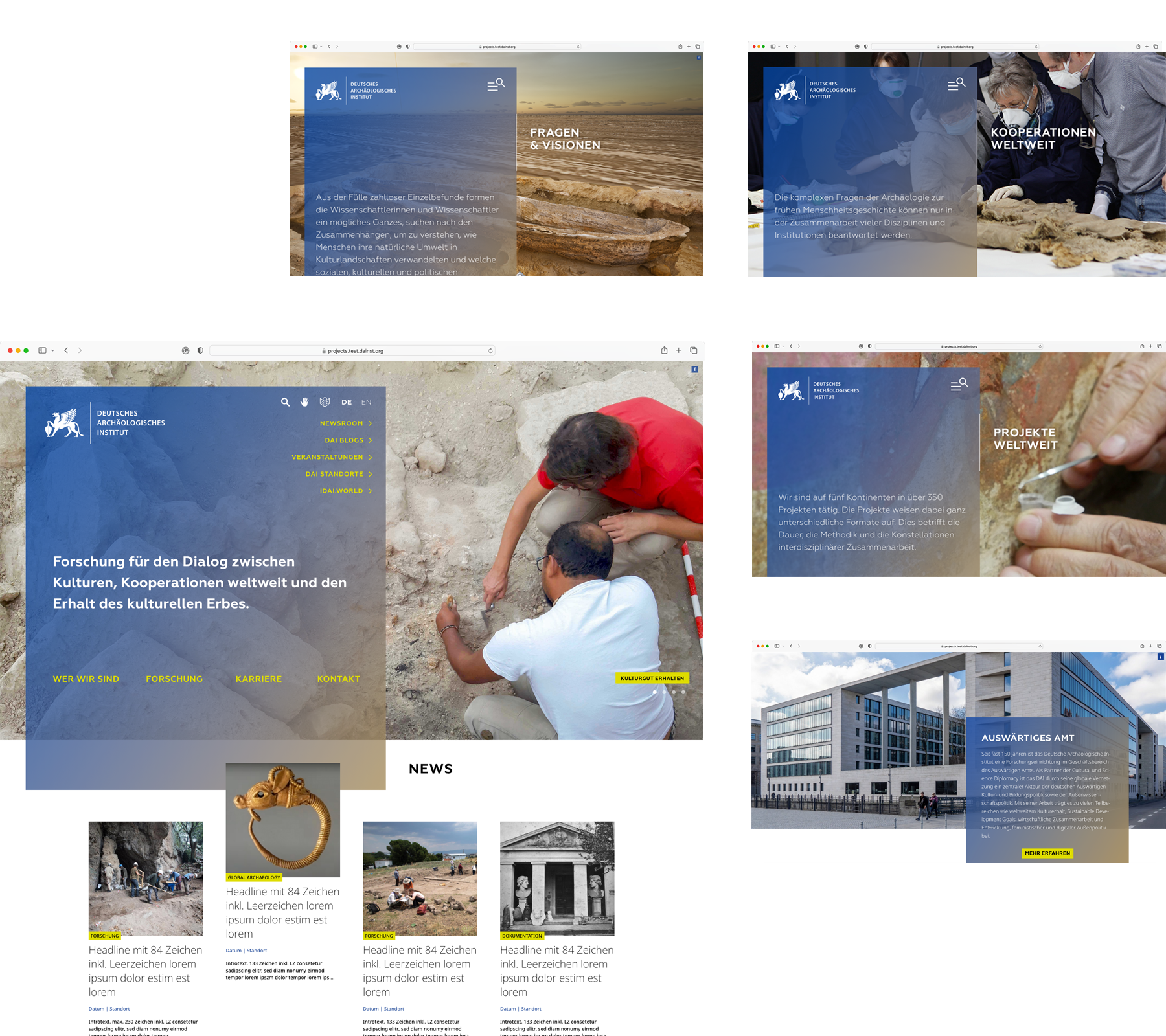
The implementation of the new CD is happening in phases. Starting with the annual report in 2021 and the redesign of the DAI web portal in 2022, employees from all locations will be involved in the implementation. Manuals and specific design templates are available to the various editorial departments on the DAI intranet.
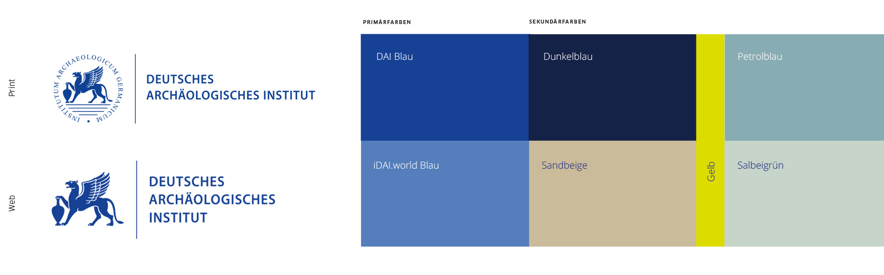
Logo & Colour Scheme
A web-compatible version was added to the classic DAI logo in a circle. The DAI logo for digital applications is simpler and clearer in contrast, for better legibility on digital devices. This is playing an increasingly important role, as the DAI now publishes many of its research results in digital formats. Because the collected data, methods and their networking is digital.
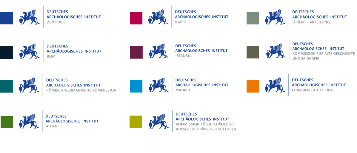
In addition to the primary DAI blue, further secondary colors were defined for a more lively and varied design. The color spectrum is dominant blue with light, earthy and natural additional colors and an “interfering color”.
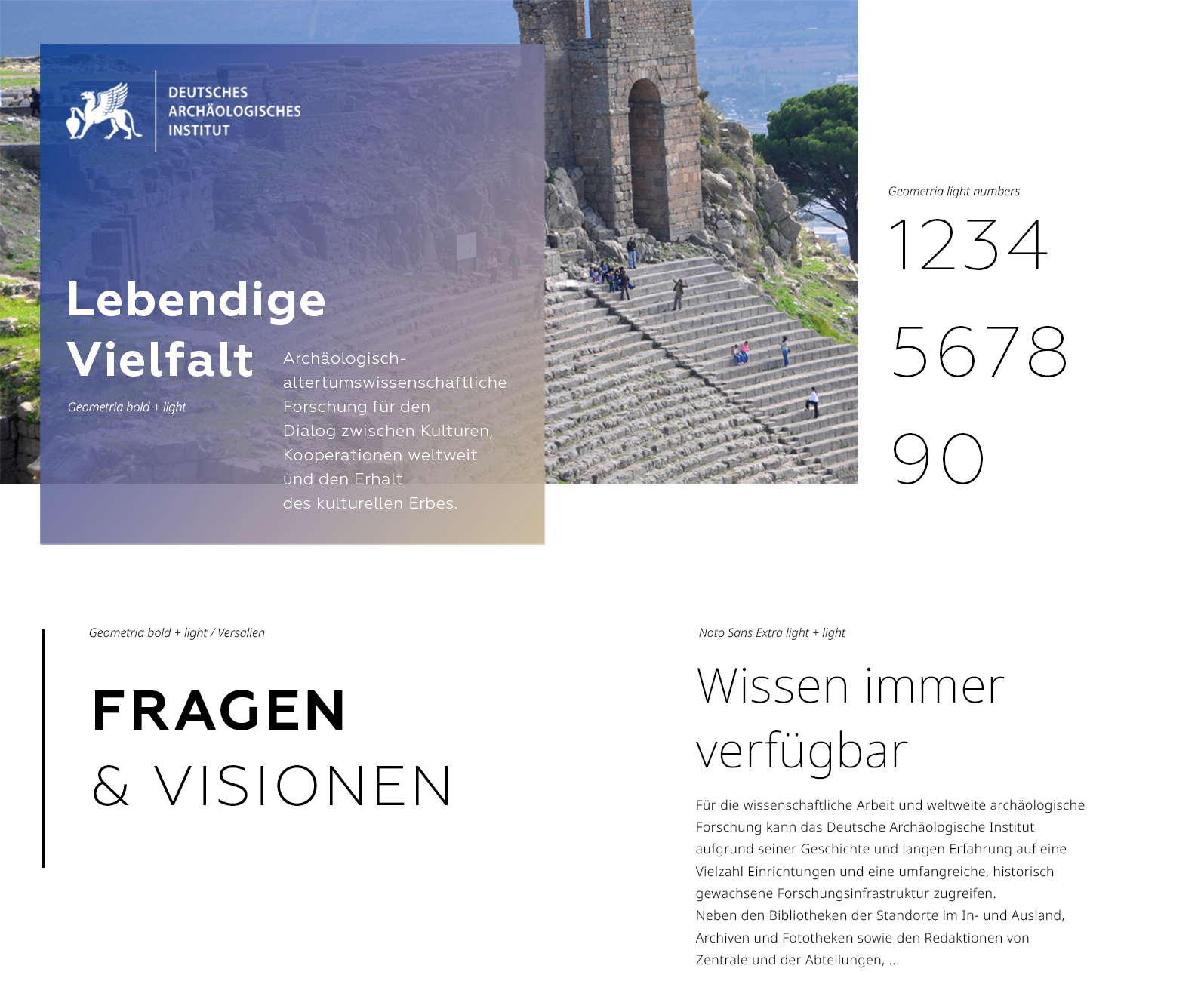
Typography & Labeling element
For a clear and open typeface, “Geometria” is ideal for headlines. This typeface is not only called “Geometria”, but is also an extremely balanced and geometric typeface. Due to its high x-height, it is very easy to read in all sizes and media. It reflects the character of the democratic, open and modern institution. It can be easily combined with the second chosen font “Noto Sans”. Noto is a typeface family of open source typefaces. It is not only characterized by its many font styles, but also the large number of languages and special characters. Well suited for the DAI and its classical text types.
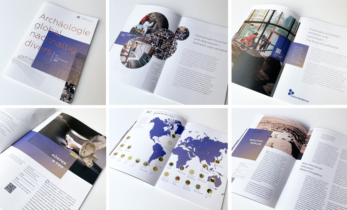
Another visual design element, the transparent color gradient from blue to beige, can be found in rectangular areas that are offset over images or used as backgrounds and areas. This labeling element not only reflects the complexity, transparency and perspective of the excavation process, but is also the connecting element between text, image and white space. A simple and flexible feature, distinctive and always recognizable.
Authentic and documentary imagery
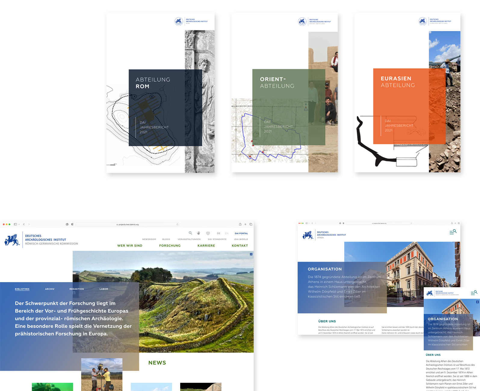
Large-format motifs should be interesting in perspective and still have a sense of tranquility. Snapshots in real, earthy colours have a close-up effect and give direct insights into all areas of work. The image material, 90 % of which comes from the DAI’s own image pool, is a treasure of historical photos, natural and cultural landscapes, excavation sketches, technical drawings, research results, 3D models and map views. In addition to the striking large formats, image motifs can also “overlap” like collages in order to visualise complexity and multi-layeredness.
DAI Locations
Internationality, research and scholarship have played an essential role since the founding of the Institute. This is reflected by the DAI departments and commissions at 11 locations worldwide and numerous research centres. Their independence is also reflected in the new design appearance. A specific colour spectrum, which has already been used in publications, is now the main identification feature alongside the location logo. Each location can use its own colour to highlight its content. The same design rules apply as for the umbrella brand, only with the use of more white space.


You must be logged in to post a comment.