Das Editorial Design der DAI Journal Reihe
For more than 100 years, the German Archaeological Institute has published its scientific work in its own numerous journals worldwide. These are mostly historically grown and published by the DAI locations, in German, English or national language.
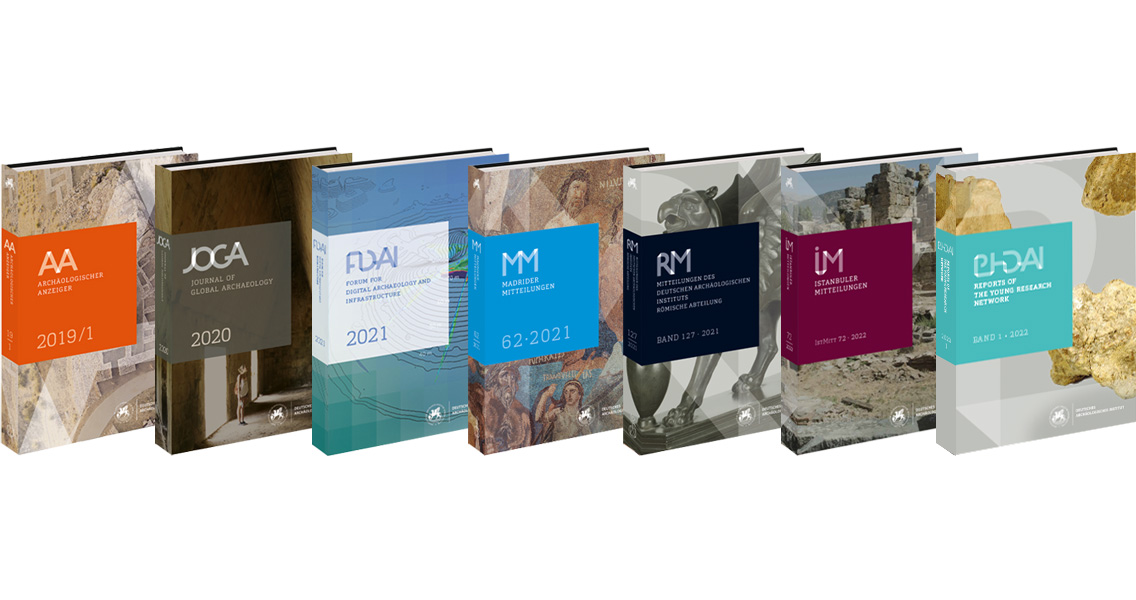
The challenge – to develop a corporate design for 12 traditional DAI publications by publishing them as a series as well as each with its own identity, for print and web.
Der Entwicklungsprozess
n the course of a technical redesign, a concept was needed for the visual appearance and coherence of the individual publications in two formats – as a book and a website. (see the article “Scientific publishing – as a book and online” and “DAI Journal Viewer Trailer”).
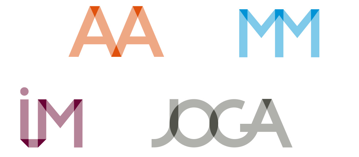
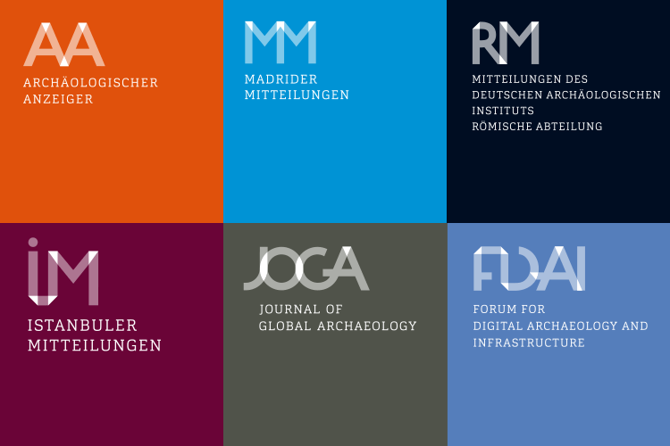
In workshops, we jointly defined the central values for the design process as open and transparent, scientific, modern and collaborative. Important design features were to be the specific logo of each publication and its colour. The naming of the publications and the resulting letter abbreviations such as “AA” for “Archäologischer Anzeiger” or “MM” for “Madrider Mitteilungen” were decisive for the logo development.
The design concept developed by LMK is based on the one hand on the interplay of overlapping, transparent surfaces and on the other hand on a connecting band. The two to five letters on which the logo initials are based are constructed as if they were made of a transparent band. This ribbon connects not only the letters but also symbolically the different publications. Intersections or overlaps of the folded ribbon are highlighted in colour. The logos are all individual due to their different letter combinations and colours, and yet their way of construction connects them to guarantee the recognition effect of a family.


Die Strategie
For such an extensive series, the design should be clear and simple, especially with regard to the many individual logos and publication formats. It becomes complex enough in the various applications of the design. For example, printed formats require scalability of the brand. Digital formats are additionally dynamic and mobile. That is why a logo needs different versions, depending on the media output.
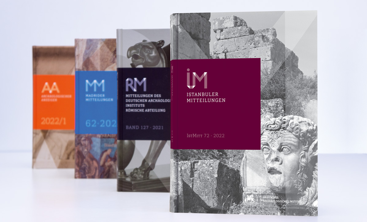
Here, the design concept of letters and colours can be found in all areas of the design – the book cover and page layout, up to the header and the navigation of the online version of each individual article of a publication. With the visual elements – logo, colour, typography – moving within a stringent structure, an unmistakable brand is defined. It is consistent across all formats as a series and yet differentiated within the various individual publications of the locations.
This strong visual structure is crucial for orientation within the publications and their very specific content. Above all, the visual structure serves the recognition and attribution of the author, despite a wide variety of channels (print/web) and locations worldwide. An article, whether in the book edition or in the online format, is unmistakably associated with the DAI Journal series in terms of both content and visual appearance.


You must be logged in to post a comment.