
Corporate design of Berlin Water Utilities
The challenge
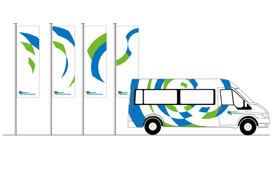
On behalf of and together with Büro Botsch, it was necessary to design a visual system for the appearance of Berliner Wasserbetriebe that was both moving and unmistakable. That was 2001. Nowadays, the appearance of Berliner Wasserbetriebe in the city has become self-evident and unmistakable.The solution
The developed mark up element was derived from the forms of interference on water surfaces: Circles (waves) that start from a centre and grow outwards, creating a diverse system of surfaces in the overlap. These combination possibilities, supplemented by colour and typography, form the character of the corporate identity..


You must be logged in to post a comment.