About structuring content, developing grid systems and the importance of white spaces. As a basis for design whether in print projects or digital applications.
We are used to living in and with structures –
in architecture, cities and open spaces, in industry, on the internet, a chess board, even on toilet paper – ultimately in nature, in every cell.
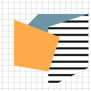
Structures are natural and constantly changing through new influences. This is also transferable to visual design. Visual structures give us orientation. They organise the mass of information that affects us and change according to format and zeitgeist. These structures help us find our way around and act more effectively.
My experience has shown me that a profound visual structure originates in its content – the conceptual structure. The conceptual structure of a project should be researched in detail, broadly based and flexible in order to have a good foundation for any design. For this, we need the content first and foremost.
How do we build a visual structure?
Collect content and order it
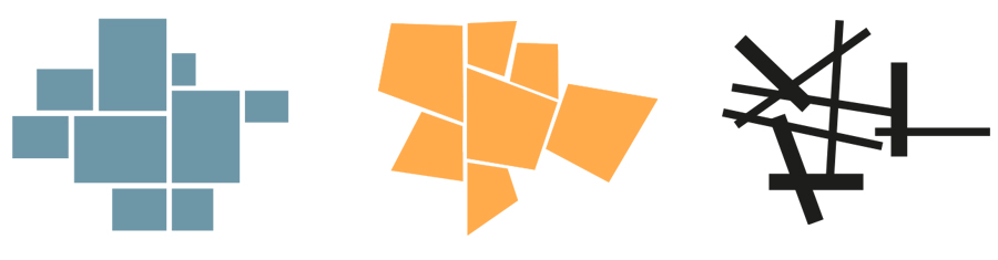
One of the first things we designers learn is to visually order information so that it is readable and distinguishable. We filter out the most important information from a pile of disordered information and structure all the remaining elements proportionally.
To get specific information, the ”soft factors“ (Lexikon) or also ”human factors“ (Wiki) of a company, an institution or a project are the decisive ones for me. These ”soft factors“ determine how loud, fast or colourful the structure becomes. (Read also ”Projekt Briefing“)
Basically, we develop these content structures to understand what it is all about. To orient ourselves, to organise ourselves and to prepare the next steps.
Building structure systematically
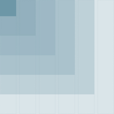
In the next steps, design structures are derived from the ordered content. Especially in the case of extensive projects where different media are to be designed, it is necessary to develop visual structure systems, also called grid systems. In order to ultimately have a tool to efficiently organise space, texts, colours, images and all other elements to be designed and to scale them to all formats.
Grid systems thus promote the handling of proportion, rhythm and consistency within a project to be designed. It helps to develop relationships and hierarchies between the elements and leads to more clarity. It is also about developing an exciting rhythm of elements and yet remaining consistent over a spatial or temporal span so that the theme of the design remains recognisable.
A grid system could be seen as an invisible glue that holds a design together. Even if the elements are physically separated from each other, something invisible binds them together.
Wether a grid system works is depending on how much structure should become visible in the design. Because too much of it looks boring or monotonous. Too little, makes you disoriented.
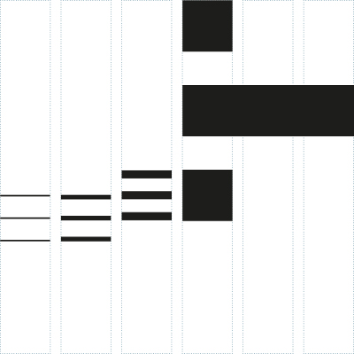
Giving the structure a rhythm
Creating a design is similar to composing music, only not with sounds, but with visual elements. There is loud and quiet, narrow and wide, black, grey and colourful – all together in an exciting rhythm. For these shaping elements, we need the discussed grid structure in the background. How we order them defines the tonality of the design. If you place elements close together on the grid, use bright colours or design with a lot of space – each single move has its own effect. This effect should be coherent with the content of the texts and images.
In addition to the common design elements such as typography, colour, shape, image, there is one element that is often not mentioned – the white space between the elements. This has a great effect on all other elements. By using a lot or little space, you set focal points and thus also control the flow of reading. The white space gives the content more weight or highlight. It guides the eye and lets it perceive the presented content in a structured way through “visual pauses”.

Ultimately, all these visual structures are about human perceptions (Wiki) – – in particular, vision. We “understand” seen information more easily by perceiving it in “bits” and not all at once in equal strength. Building up a structure in terms of content and design therefore promotes communication between sender and receiver. The more specifically structured by the sender, the better “readable” by the receiver. Because with the increasing flood of different media and formats in which we move, it would be a pity if the content is “missed”.
You must be logged in to post a comment.